Brand Design
Client: Dexie
Objective: Create overall look and feel of the brand. Logo, font, color.
Role: Visual Design
Programs used: Illustrator
Design Process
Sketches
Client sent over a quick brief of the company for us to begin crafting an identity.
Our audience is business professionals of all shapes and sizes but we would like to prioritize the expectations of the innovative, technical crowd - so although the name is relatively playful we might not want to play too far into the youth of it. Sophisticated, innovative, modern, clean, young, and organized are key characteristics but still very, very vocational focused.
Digitizing the Rolodex as a mobile application for a clean, organized, secure, dynamic, friendly interface where users can sort their professional contacts’ information in a way that makes sense to them (personalized experience with auto generated tags/custom categorizing/note features). An app specifically wired for business contact storage yielding the next evolution of business cards that are no longer static and refresh in users’ dexie upon updates made by owners to their contact information & job changes.
From these descriptions, I identified key words that would be used through this process for the logo, font, and color.
Professional, Innovative, Technical, Sophisticated, Innovative, Modern, Clean, Young, Organized, Rolodex, Community, Connection, Easy, Quick, Contacts, Auto Update, Cloud, Sync
I simplified the list into 3 main key words (bolded above).

Digital Mockups
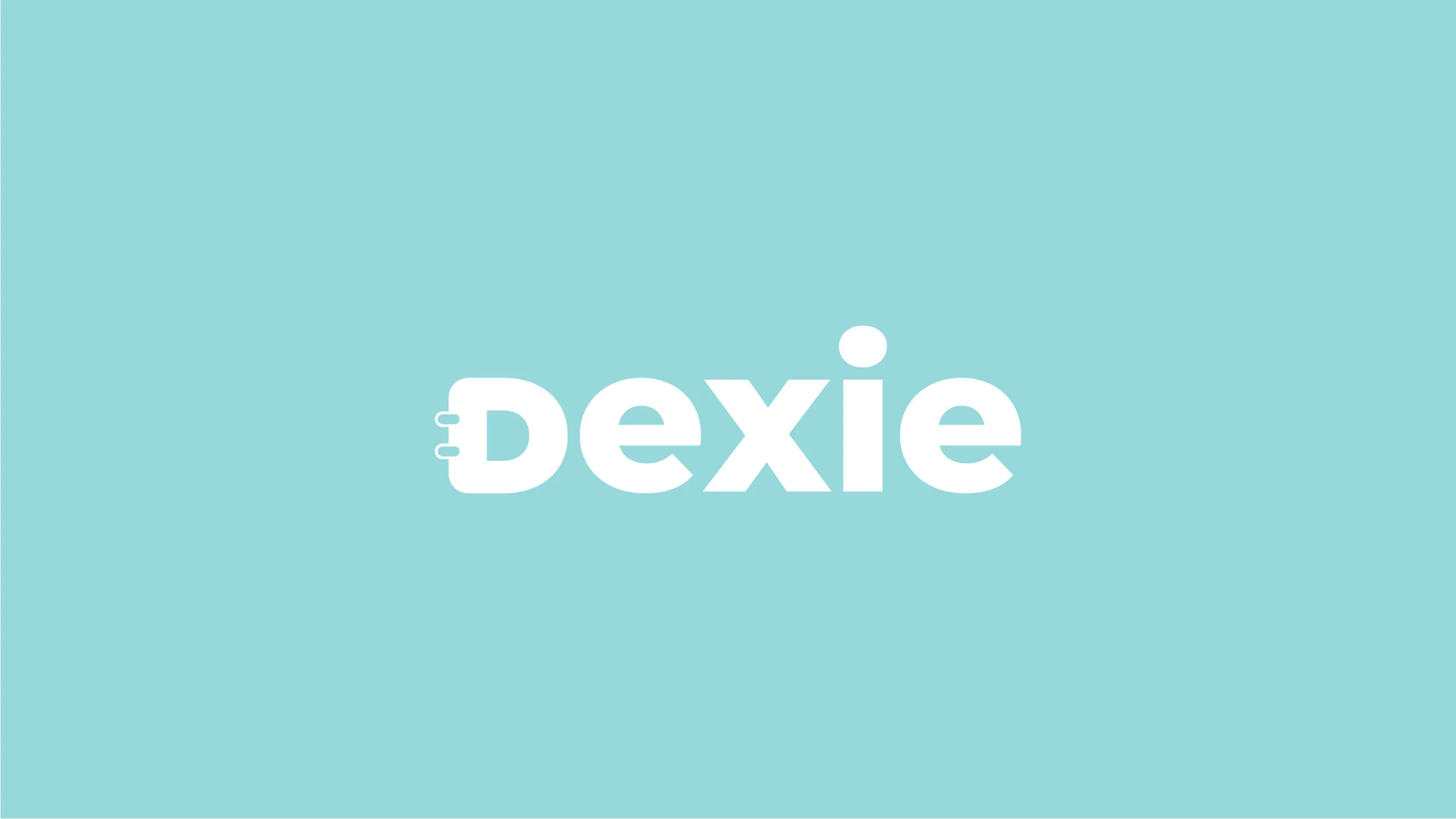
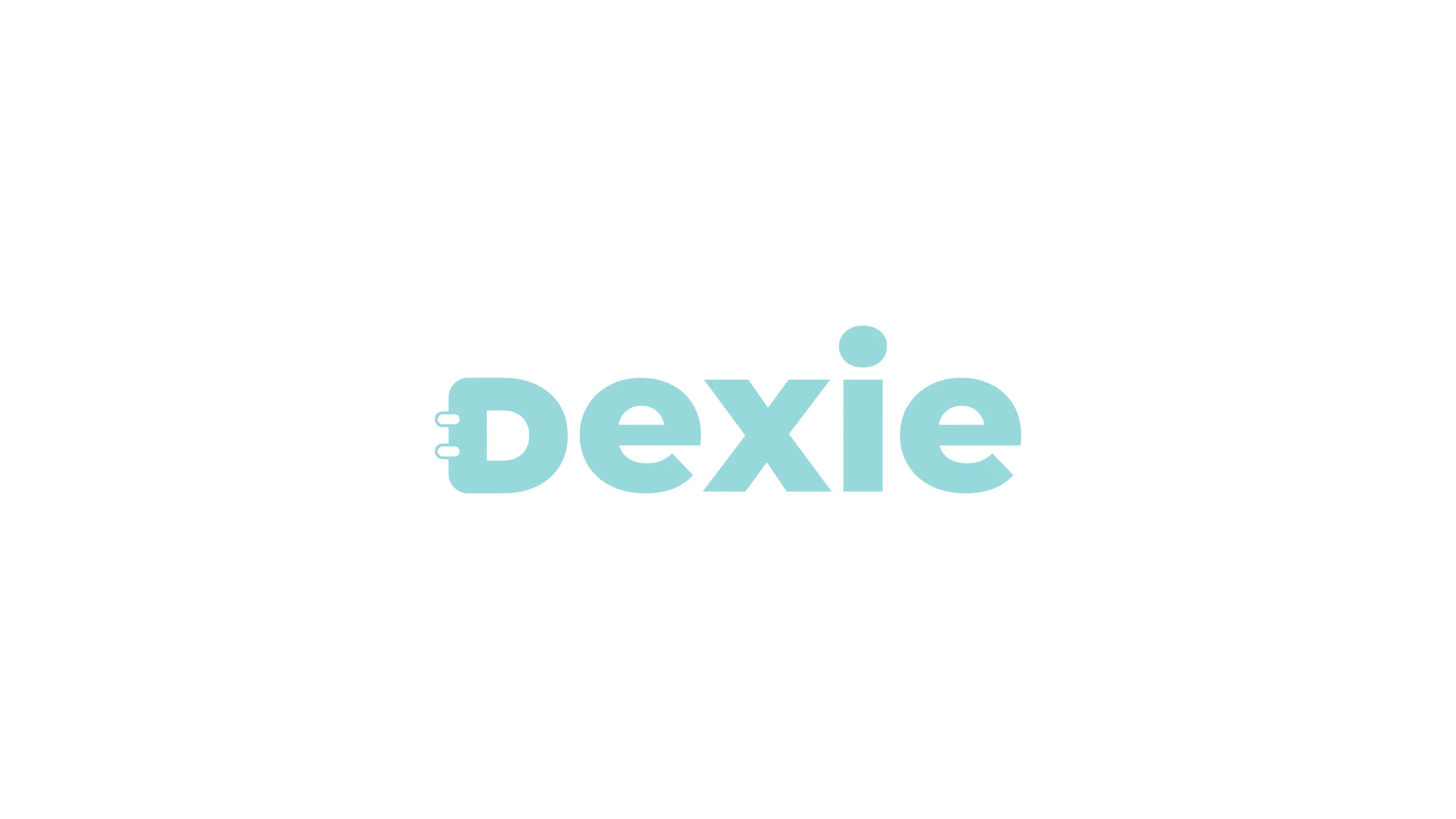
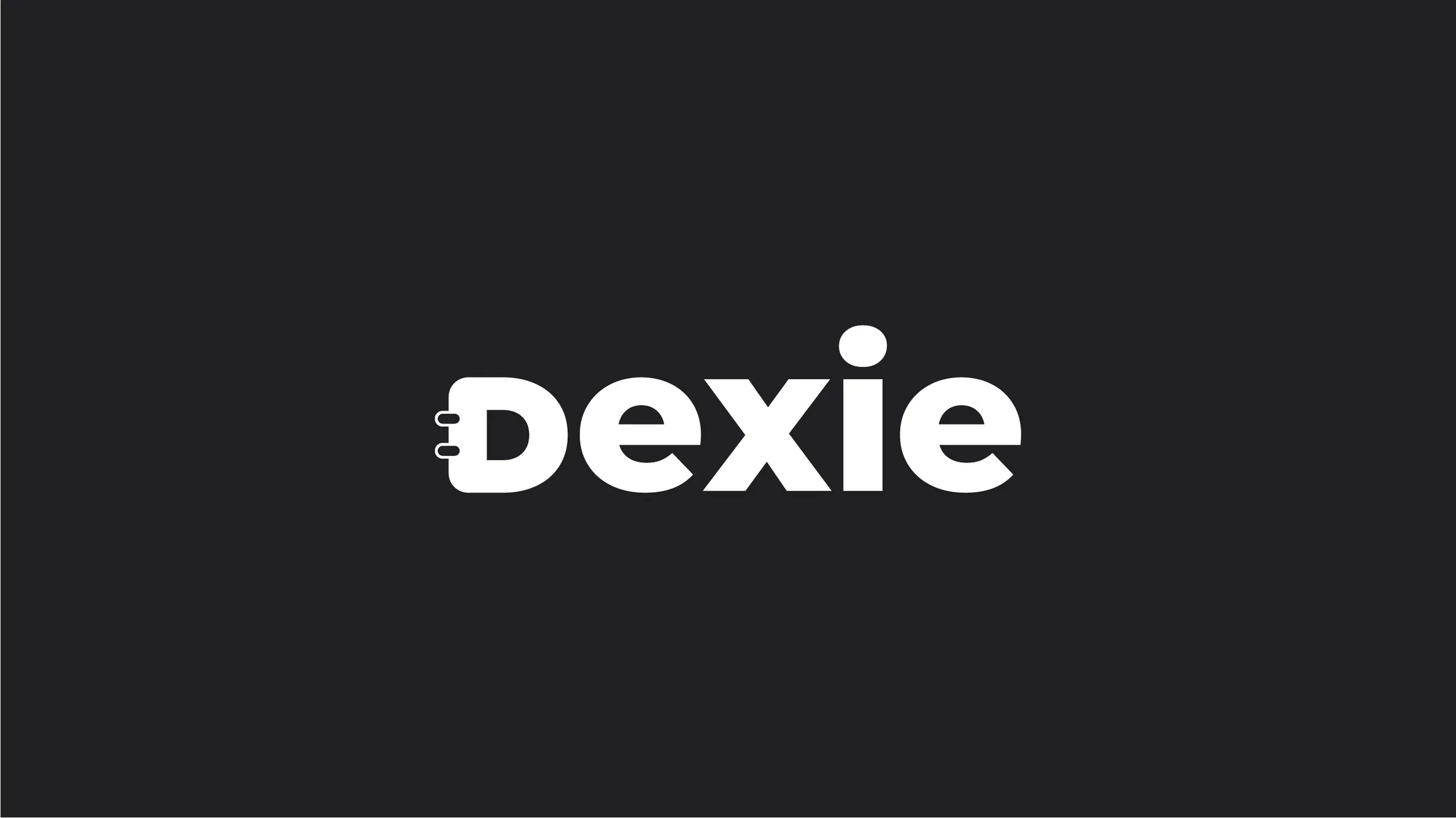
Many variations were created based off our initial review of my sketches. I focused on the D as the main point of the logo, something that could stand alone or be used with the company name. The font was chosen to be modern and clean. I like to use google fonts because of the expansive font families they provide.

Color Exploration
Many different color combinations were tested. We decided to default to a soft blue to be consistent with a majority of brands. Blue tends to be a safe color for tech companies. Here are a few of the colors we went through.
Final Style Guide


