Web UX, UI
Client: Practicing Musician
Objective: Create a customized website for users to learn how to play instruments. We needed a backend CMS and a front end site.
Role: UX, UI, Graphic Design
Programs used: Sketch, Photoshop, Illustrator, InDesign, Zeplin
The Problem
Music is an art form that, in almost every case, requires training. Price deters many people from taking music lessons. Locating high quality, efficacious instruction is difficult and time consuming. Standard online services detract from teacher-student relationships.

Our Approach
Create videos and an online feedback training tool we could give the training required to learn an instrument. Cheap monthly subscription for music lessons. Short but efficient ready made videos that can be accessed anytime and anywhere through an easy lesson plan. A community forum board for communication between students and teachers.
Site Vision
Incomprehensive K-12 music teaching tools in schools and lack of affordable and effective supplemental instruction. Affordable and customizable instruction via mixed media.
Competitive Analysis
Multiple competitors were established for us to see what they do well and what we can improve on. YouTube, Hal Leonard, Jamplay, Drumeo.
User Profiles
47.2 million public school students in the United States have access to in-school music program. This was our initial focus for the site, the students. Profiles for students, teachers, and parents were our focus.
Design Solutions
Branding
Before we started on the site, we needed to brand the company.

Frontend Flow Chart
The sites complexity grew as we discussed what we wanted on the site. After a flow chart was created we hired developer that helped us create exactly what we wanted.

Backend Flow Chart
A customized CMS system was required for us to meet all our needs.

Wireframes
Wire frames were created based off the sitemap flow. Multiple versions were used as the sites vision grew. We started with a simple page overview and later added specific sub page wireframes.

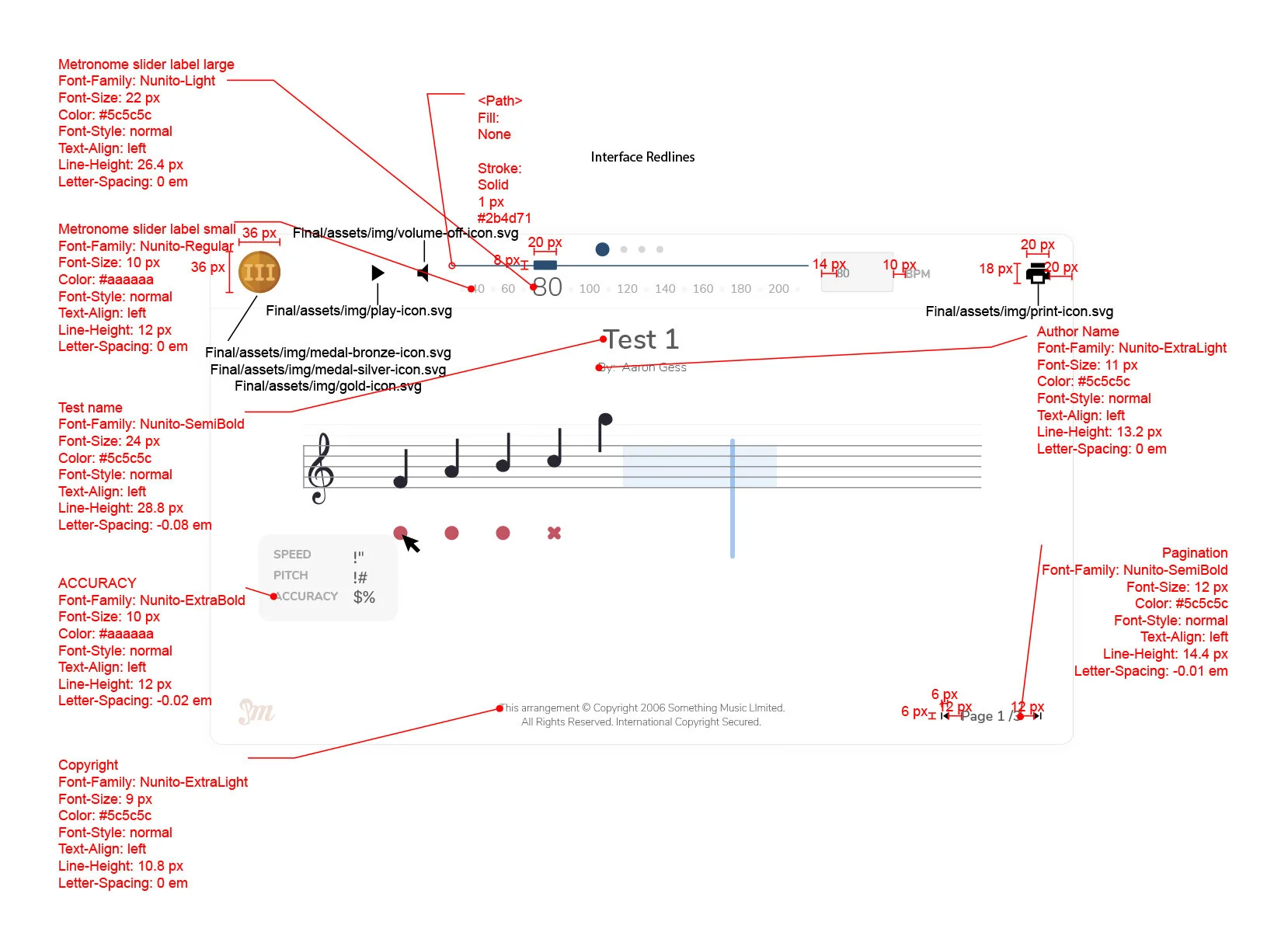
Backend Style Guide
Multiple developers were creating the site so we needed to organize everything for them and any additional developers that we brought on. Great detail went into properly communicating sizes, spacing, color, font usage, and icons. This also assisted with my vision of how the sites look and feel can be maintained. In addition to this guide we used Zeplin for specific size, spacing, and padding.

Real Time Feedback Tool
This was an integral function of our site. I found a developer that could make my design possible. Users could play their instruments into a microphone for accuracy feedback on pitch and rhythm. We placed these tests into our lesson plan as an additional tool for learning.
Continued Enhancement
Through user testing at k-12 schools we found many opportunities to further develop the site.

Achievement Progress
Just like a student would have a report card, we wanted to have a summary page for students to review their progress for each instrument. We didn’t want to call it a report card and found achievements were less intimidating. Medals were used in place the normal A, B, C, D, F grading scale. The student could use this page to continue where they left off or retake an exercise.

Replay Practice
We found through user testing that many users wanted to hear their best recording of a practice session. All additional features went through me so the design would stay consistent.

Other Replay
Because this was a common suggestion for the site, we also added a replay immediately after you finished a practice. Modals were used whenever possible on the site to reduce pages. This also allowed them to stay on the lesson plan while providing useful information.
User Feedback
To get more feedback through the site we created a modal that appeared after the first completion of a chapter. We did this to avoid annoying the user.

Always Improving
Because of the constant feedback we’re always finding ways to improve the site.

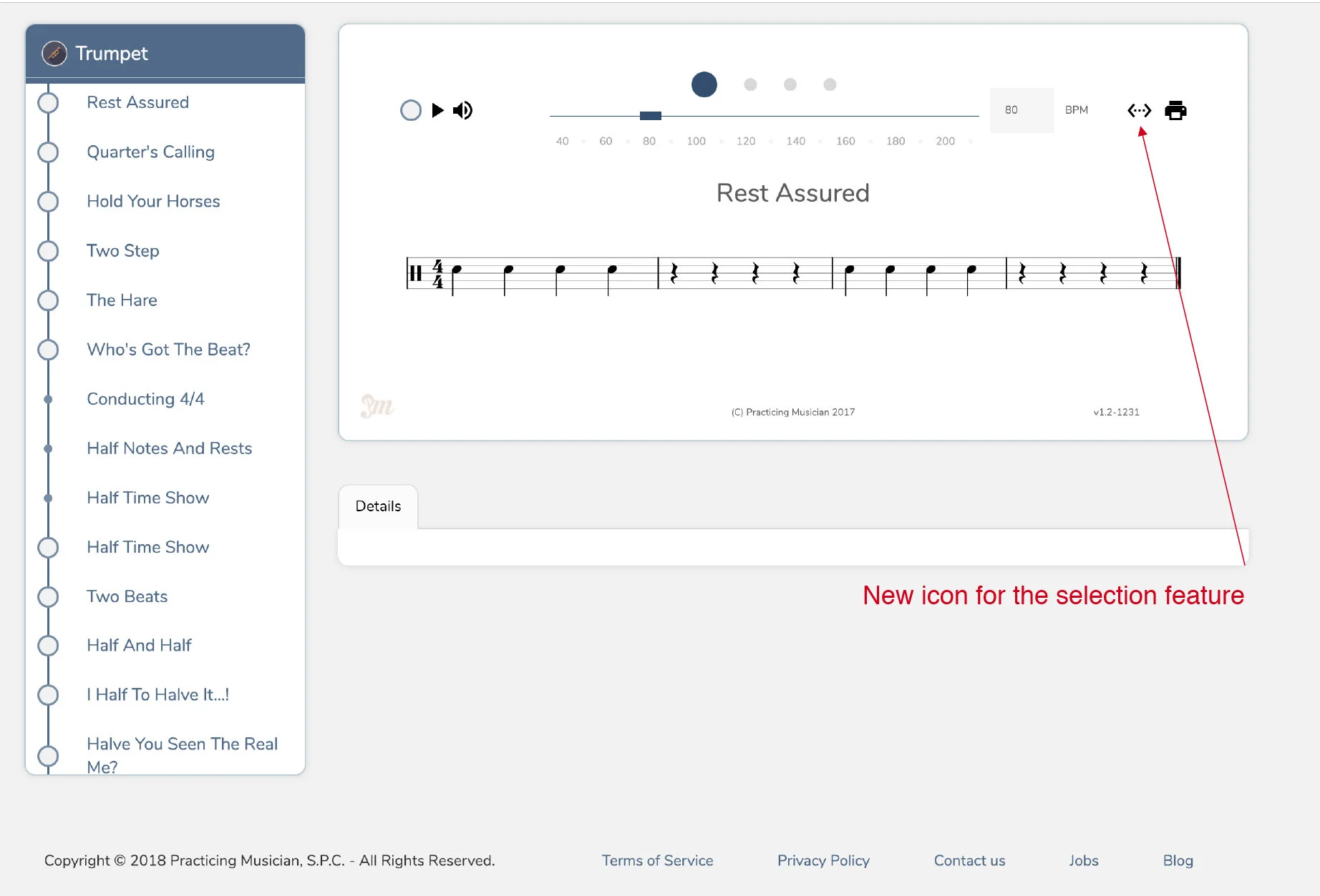
Flexibility
Subtle additions to provide an easier experience.

Selection
Giving the users more control of the lesson they’re on.